


Not more than a year ago, the health and beauty industry was derided for being one of the slowest adopters of digital technology. But with the first Beauty 2.0 Awards Summit fast approaching this November, one thing is clear: the digital revolution has officially hit health and beauty, whether companies are ready or not.
In conjunction with our previous blog posts regarding online and mobile adoption in the health and beauty space, we’ve gone through the recently announced Beauty 2.0 finalists and, for a handful of categories, highlighted some trends and made our picks.
BEST BRAND WEBSITE
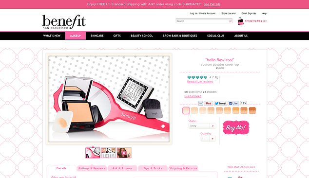
The most obvious commonality between each of these finalists – Benefit, Dior, Guerlain, Mary Kay, and Rimmel – is that large, high-definition images take center stage in all product pages. Dense text is either hidden away in tabbed or scrollable frames, or tucked below a large and cleanly minimalistic product showcase. The result is a streamlined browsing experience, much like perusing the shelves in a chic boutique store.
Each of these finalists also incorporate some assortment of magazine articles, blog posts, videos, and ad campaigns into an all-encompassing brand experience on the website. Each experience is slightly different (sleek videos concealed in sliding frames on the Dior website, for example, evoke a much different feel than the numerous articles presented in a colorful, magazine-style layout on MaryKay.com) but the effect is much the same. It’s easy to forget you initially visited the site to simply buy something.
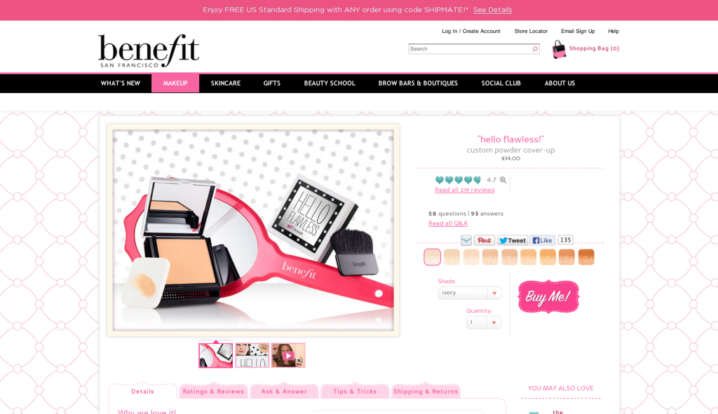
While each of the websites in this category expertly emulate their brands’ unique identities, only Benefit also manages to incorporate extensive product information – ingredients, tips, lengthy descriptions – into the layout without distracting from the streamlined aesthetic. It also seamlessly incorporates any ad campaign material and application tutorial related to a particular product directly into the product pages.
Thus, Benefit.com is the rare example of a site that acts as both a sleek product showroom and informative one-stop shop.
BEST E-COMMERCE WEBSITE
These sites effectively move away from shopping and into the hard sell. Whereas many of the sites in the previous category compromise comprehensive product details for a sleeker aesthetic, the finalists in this category – Bobbi Brown, FeelUnique.com, Sephora, The Body Shop and Aveda – provide all relevant information for purchase right at a customer’s fingertips.
One of the most notable features of most of these e-commerce sites is the level at which customers can drop down into categories of products. General floor categories like hair, makeup and skincare sit at the top of the list, with further filtering available by brand, skin type, health concern, and collection, among others. While particular products may not be as sophisticatedly showroomed on these sites as compared to on others, customers can ultimately find these products very efficiently.
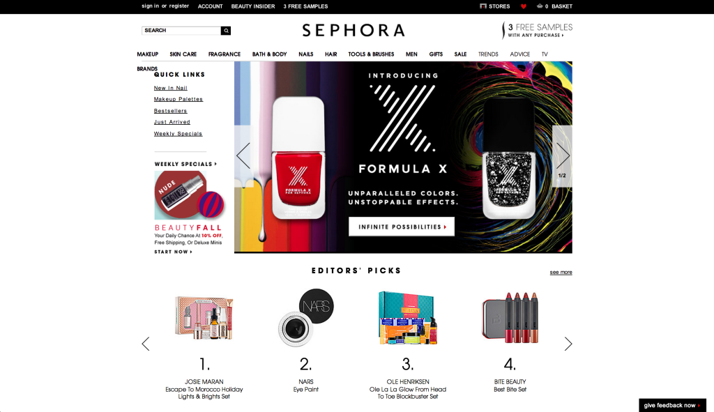
We picked Sephora as our top e-commerce site. Not only is there an extensive wealth of information hidden in a streamlined layout, but the consumer’s ability to effortlessly browse through hundreds of brands and thousands of products on this website still goes unparalleled. And with sliding frames showcasing editors’ picks and best-sellers right up front, the process for discovering new products is similarly seamless.
BEST MOBILE SITE
With the exception of large images and plenty of video to go around, the mobile apps in this list of finalists have little in common. This is great news for others who are in the process of adopting their own apps, as there’s plenty of creative freedom for a brand to make its mark.
L’Occitane provides a scan feature that allows customers to direct their phone at a product’s barcode for more detailed information. NYX showcases a selection of products and provides a handful of additional features, including virtual try-ons, rewards, and tutorial videos. Make Up For Ever’s Pocket Studio consists entirely of videos that give users tips on the go for creating the perfect look and fixing up pesky beauty “SOS’s” like redness and tired eyes.
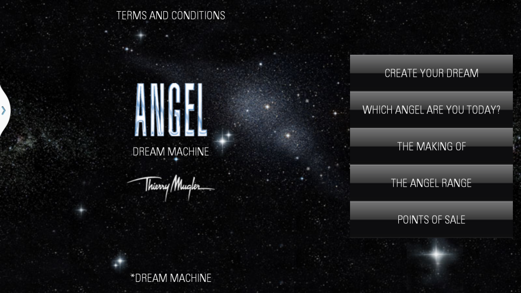
This app is an add-on to Thierry Mugler’s “Angel” fragrance, thus its focus is less around mobile shopping and more about creating a specific product experience. Users can watch exclusive interviews featuring “Angel” spokeswoman Eva Mendes and learn more about each of the products within the line. Most notably, users are also prompted to “create your dream” by picking from five adjectives, from which the app creates a custom video that users can share via social media.
It all might seem over-the-top, but the app is a prime example of how far companies can go to strengthen loyalty in a product.
Takeaway
As health and beauty companies continue to find their stride in the digital revolution, these Beauty 2.0 Award finalists provide motivation that the industry can thrive in the modern digital marketplace. We’ve tried to step into the shoes of the consumer to see which finalists leave the most lasting impact today, but as we’ve also learned, there’s plenty of creative room for other companies to swoop in and deliver the next best thing.